
My Role
I produced sketches, wireframes and the visual design for these product improvements and feature updates. I worked closely with 1 product manager, the CEO and 1 developer to release these updates.
Introduction
Within the Pulsate Engage product, lives two main sections: Campaigns and User Segments. When a user navigates to either of these sections, they see generic list screens with basic filtering options and statistics. Since there are multiple campaign types with various states at any given time, this is not immediately apparent at a glance of the campaign list screen.
My role for this design update was to improve the visualisation and usability of these sections, starting with the campaigns section.
Problems with the Current Design
- As mentioned above, there can be various campaign types, however they are all displayed equally and it's hard to tell them apart by viewing the current UI.
- At a glance, it's difficult to understand the different statuses of these campaigns. Again, they look the same.
- The design of the rows feel too repetitive and cause a high cognitive load when scanning to try find something.

Constraints We Faced
- There are multiple different things between the campaign types - their notification type, where they link to and if they have A/B split-test enabled. The challenge was to design a UI that could be easily organised by these campaign variations.
- By adding more information to this screen (text, icons, colours, tabs), there was a risk of this screen becoming too busy and complicated. There's no point in a design update that looks visually appealing if your users can't understand how to use it.
Updating the Navigation
A problem with the current navigation is that it hides the sub-menu options of the other sections.
The user has to navigate to each main section in order to discover what sub-sections live there. This requires an extra click and also for the user to shift their focus as they navigate around the different sections to find the sub-section they're looking for.
This layout can cause the user to easily forget how to get back to where they previously were, while requiring them to think about the section they wish to navigate to.
After trying out different concepts, I discovered that I wanted to boost the navigation experience by always displaying each section with the corresponding sub-sections, rather than hiding them.
I considered displaying the sub-sections on hover (see Concept 4) but I still felt like this was hiding them too much.
My conclusion was to opt for a traditional approach, to display each section title, while highlighting the active sub-section and displaying every other section and sub-sections for quick access.
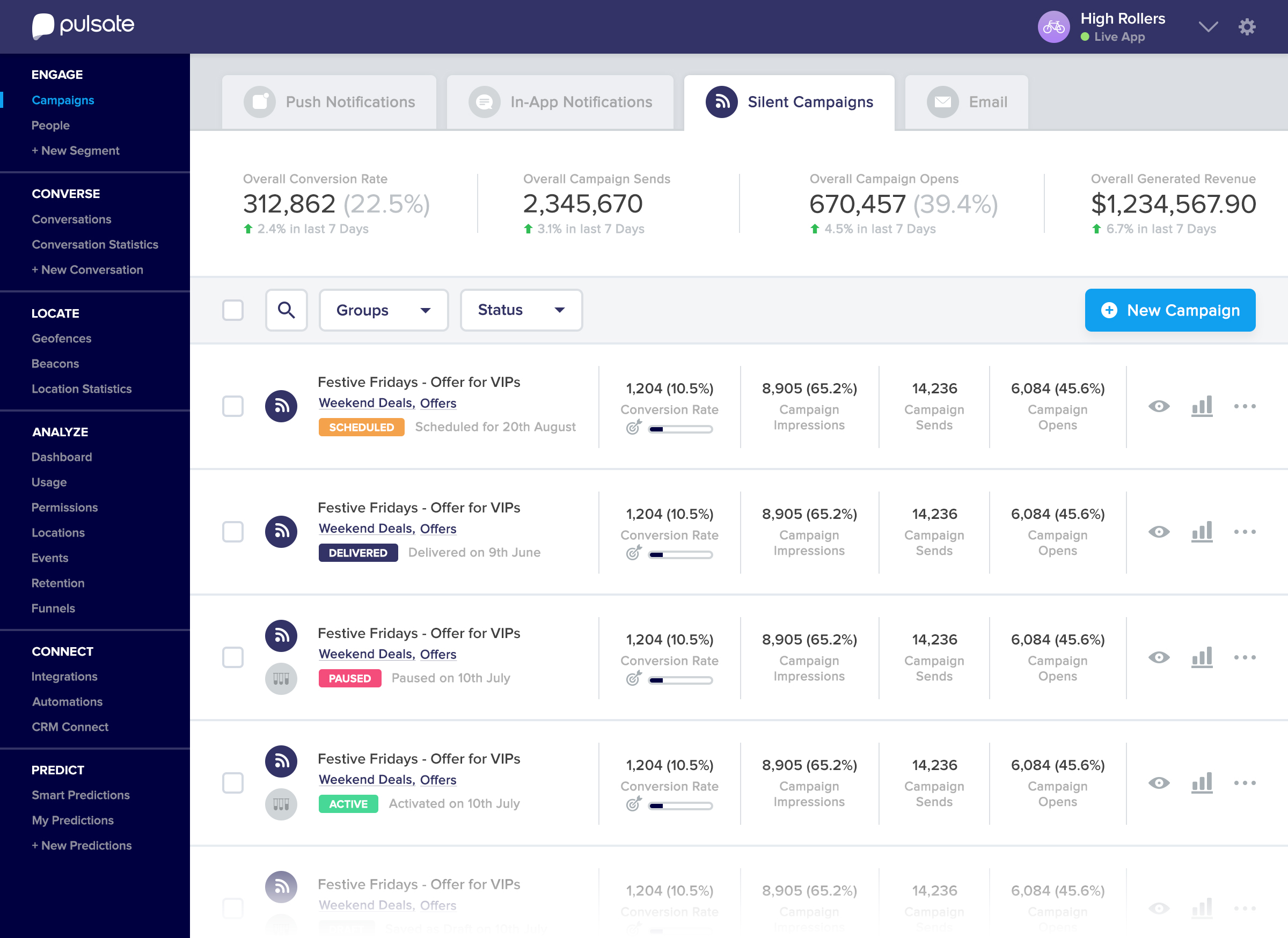
Tabbing as a High Level Filter
When I was satisfied with this new navigation layout and hierarchy, I then broke down this screen by the different campaign types:
- Push Notifications
- In-App Notifications
- Card Only (Silent Campaigns)
- Email Campaigns
I wanted to allow the user to easily jump between these different campaign types with one click. This is why I opted for the chunky tabbing style. The icons in these tabs would also be displayed in the rows, to provide further clarity of the different campaign types.
Varying Statistics for Campaign Types
Each campaign type has a different behaviour in how it reaches the end user and how they might interact with each campaign. This required different statistics to be considered and displayed when navigating through the different tabs. These statistics vary in the top overview statistic boxes and also in each list item. Another varying factor to be considered was the actions allowed for each campaign type. Depending on its status (Active, delivered, paused, scheduled or drafted), an admin can perform different actions on a campaign, such as edit, duplicate, pause, stop and export. Since this interface has a lot of information to digest, we opted for icons to replace some labeled buttons to create a simpler and less cluttered interface. The admin can access the actions by clicking the 3 dots icon on the right side of each row. Accompanying this actions icon are two new icons: an eye icon to display a quick preview of a campaign and the stats icon to navigate to the stats of that campaign.

Other Tabs - In App Notification Campaigns List

Other Tabs - Cards Only / Silent Campaigns List
Other Tabs - Email Campaigns List
Although we haven't developed email functionality yet, we considered how it would fit in with this update, as a way of designing our updates for the future.

What I've Learned From This Project
A list interface can double as a statistics dashboard as well as a management section. Having a separate section for the campaign statistics can cause a frictional experience for the end user when they have to jump between the two sections to learn about a campaign's performance. Instead, put yourself in your user's shoes - What top-level statistics do they really care about? Can you display these on the simple list screen without it becoming too information heavy?
Another thing I learned was that icons can benefit an interface as a visual aid, when recognisable and clear icons are used. But sometimes, it can be difficult to choose the right icons for a complex situation. If the meaning of the icon looks vague or doesn't obviously convey a meaning, you may cause more confusion in an interface with un-clear icons. If you can't decide on the right icons to use, maybe try a different visual aid to convey the same idea. Hover states, colour co-ordinated items, informational pills and tooltips are some good alternatives to using icons in an interface.
Interested in Working Together?
Or you can find me here: