
My Role
I created sketches, wireframes and the final visual design, working with 1 other designer, 1 SDK developer and 1 product manager to reach this SDK release.
Pulsate's SDK Version 1 - An Inbox for Mobile Campaigns
In 2014, we designed and developed a SDK (Software Development Kit) that could be slotted into existing mobile apps for iOS and Android. The purpose of this SDK was to serve as a two-way messaging channel for app users to receive marketing content and to be able to communicate back to the brand/organisation. The approach to the design was minimal and inspired by common email inboxes. This UI style was familiar to users and the functionality was simple.
Pulsate's SDK Version 2 - Card Style UI
In 2015, we felt that the SDK needed a face lift. The trend of card style UIs was becoming ubiquitous. Cards were becoming the go-to structure for containing and organising large amounts of content - images, headlines, main text and call-to-actions. While we recognised and aspired to this shift in design trends, we also wanted to make the SDK and its content feel more personalised to the end user. This introduced the idea of attaching personal messages to these campaign cards, to make them look like they are being sent from familiar faces within the company or organisation, rather than looking like a generalised campaign that's being sent to hundreds or thousands of users.
This new and improved version of the SDK was inspired by social media feeds, such as the Facebook and Twitter news feeds. However, rather than existing as a continuous stream of new content for the user to interact with, the SDK would deliver tailored content to the user, based on their context, preferences and interests. Merging the SDK with the capabilities that the Pulsate Engage product had to offer, marketers could create and send personalised campaign cards to the most relevant mobile audiences.
Customising the SDK to The App's Brand
Mobile apps can vary a quite a bit when it comes to their layout, navigation and brand. Our challenge was to create an SDK solution that could fit naturally within an app as its own independent section, while being completely customisable to match the app's brand.
For the iOS version of the SDK, we followed Apple's Design guidelines. The end result: the inbox design was clean, minimal and should discreetly fit into other iOS apps that follow Apple's Design guidelines.
For the Android version of the SDK, we followed Google's Material Design language. We kept it simple and embraced some subtle animations such as responsive button tap ripples.

Evolution to SDK Version 3
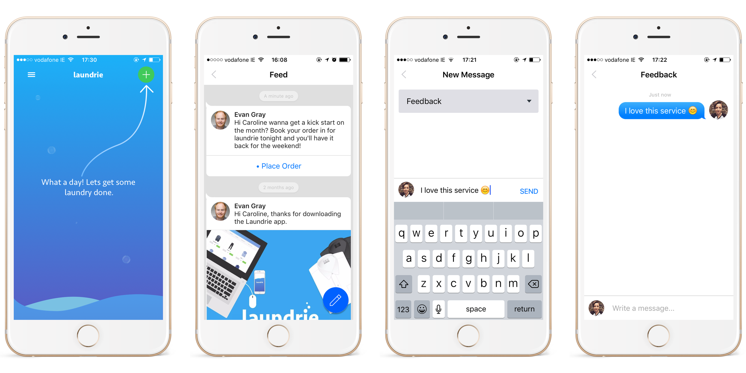
As mentioned above, the design and functionality of our SDK evolved over the years. In 2017, it evolved into a more conversational UI. Since 2016, there has been a lot of discussion around conversational UI and how the pattern of communicating with people and computers is blending in messaging.
Transforming to a Conversational UI
We decided to evolve with this emerging design trend. This transformation moved away from static campaign cards and progressed towards a familiar messaging interface. The content of a campaign card would be displayed as a conversation from the brand/organisation to the end user. These conversational elements would be:
- Text bubbles
- Image/GIF blocks
- Multiple choice buttons
- Single card or a set of cards to interact with
Included in this transformation would also be a hamburger menu button to overwrite the previous create message button. This menu button would serve multiple customisable functions, including the ability for the end user to send a message.
As we designed this update, we considered how mobile commerce functionality would integrate into it. Although this will be a later update, we wanted the conversational UI to support our initial requirements for mobile commerce functionality. As part of this, we put together typical user flows when interacting with this conversational UI and making a purchase. The two main user flows we focused on were:
- A first time user
- A returning user
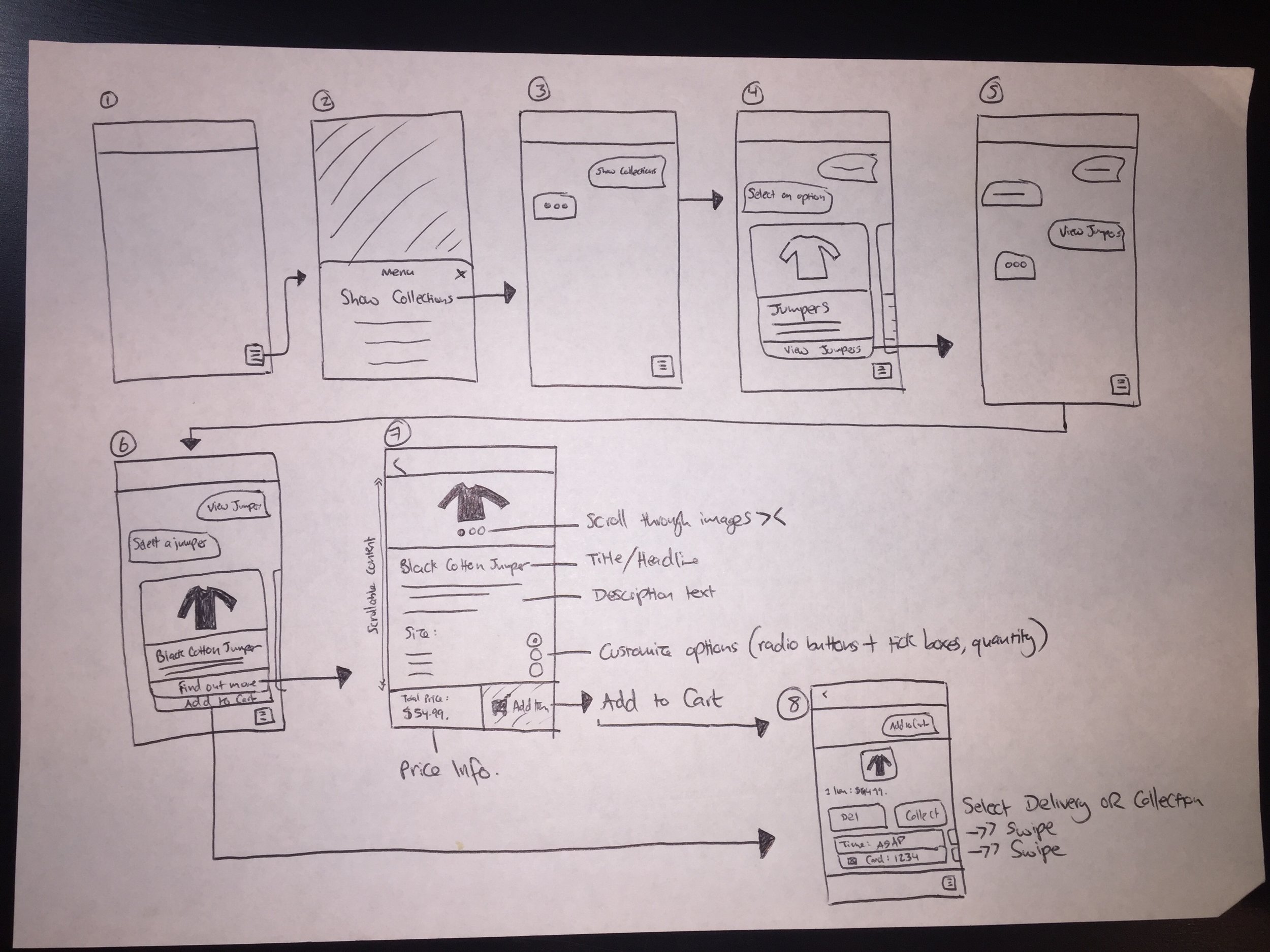
First Time User - Browsing and Adding an Item to Cart
Returning User - Viewing Past Orders

Returning User - Choosing Delivery or Collection

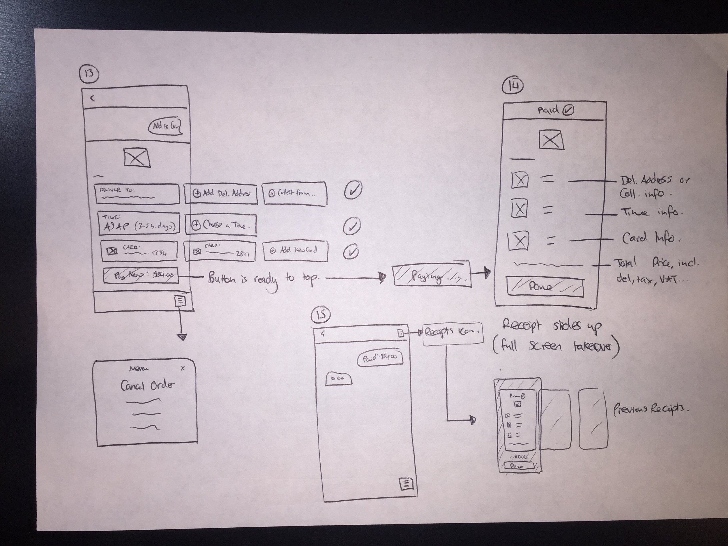
Returning User - Ready to Check Out & Pay
First Time User Flow
We wanted to create a frictionless checkout experience, similar to what the Deliveroo app offers its users when ordering food. The aim was to provide returning users a smooth interaction to quickly re-order a past order within a few taps, while providing an effortless setup process for first time users.
Sketch Designs - First Time User Flow
Sketch Designs - Returning User Flow
iOS - Sending a Message
Android - Sending a Message
What I Learned From This Project
It can be very helpful to consider future features and their requirements. In this case, we envisioned how this update would look and function as a whole, made up of multiple releases. Rather than just designing a visual update to the SDK inbox, we imagined how this update will work with the commerce requirements down the line. This influenced the components we designed from the beginning of this update, such as the conversational UI elements. Planning it this way allows us to release smaller updates at a time, moving closer to the entire vision with each update.
From my experience of working with an engineering team, it's beneficial for the design to always be ahead of development. Planning, prototyping and designing features with this approach speeds up the process of delivering digital solutions that meet the requirements and delight users, while giving the engineers the time to focus on coding and not get caught up in any uncertainty within the project.
Interested in Working Together?
Or you can find me here: