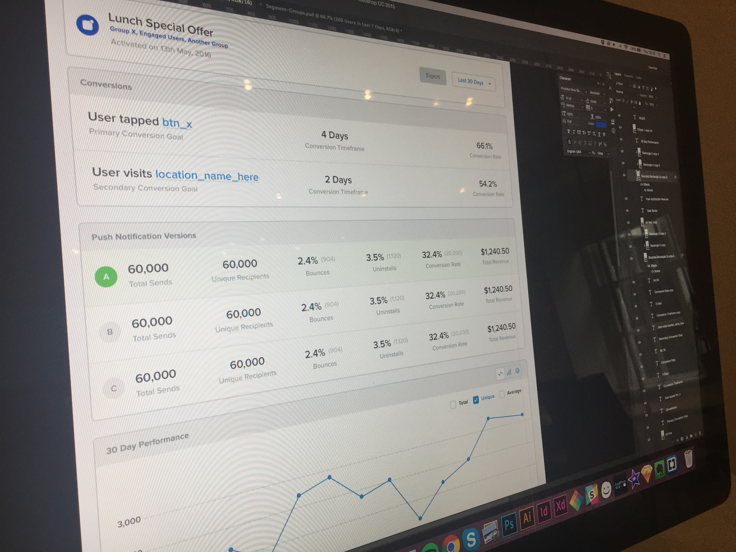
Campaign Reports UI

The purpose of the campaign reports screen is to give marketers feedback on how their Pulsate campaigns are doing and provide them with insights for their next campaign, based on these results. We want users of Pulsate to be able to see these performance statistics at a glance, without friction or a complicated interface. The challenge for me was to break down and display the most useful information on the campaign overview screen and easily allow a user to deep-dive into more detailed views of the results.
I had to consider the different use cases:
- The different types - push notification, in-app notification, email or card-based campaign
- If A/B split testing was enabled, how to display this
- The impression rates, open rates and click rates
- The conversion goal rates
How Will This Help Marketers and Users?
When faced with updating our previous analytics solution, I thought to myself - how could this update improve marketers' experience of our platform and make their lives easier?
I thought about it from a Jobs to Be Done perspective. What are the goals of the marketer?
As a marketer:
- I want to increase app users' engagement and revenue so I can improve our marketing and brand
- I want to be able to easily compare the results of my A/B split test campaigns so I can pick a winner
- I want to be able to quickly see which campaigns are getting the most impressions/open rates so I can learn how to improve my future campaign content
- I want to be able to easily export the results so I can share them with my team/boss
- I want to be able to visualise the times of day when campaigns are most successful, so I can understand when the best time to send is
I approached the design of the campaign reports screen, considering what marketers and users of Pulsate would like to get out of it and tried to make this as easy as possible for them.